How to Choose a Neutral Paint Palette for an Irish Home
Neutral doesn't mean boring — but it does require careful selection. A professional painter in Carrickmacross explains how to build a cohesive neutral colour palette for an Irish home.
“Neutral” is the most misused word in home decorating. It’s used to mean everything from brilliant white to warm cream to pale grey to greige — all of which behave very differently on Irish walls under Irish light. Choosing a neutral palette for your Co. Monaghan home without understanding how these colours actually behave is how you end up with walls that look cold and clinical, or dirty and yellow, when all you wanted was something clean and calming.
As a professional interior painter in Carrickmacross, here’s how to choose a neutral palette that actually works in an Irish home.
Why Irish Light Is Different
Ireland’s Atlantic light is predominantly cool, diffuse, and overcast. We get relatively few days of strong, direct sunlight. This has a significant effect on how interior paint colours read.
Colours that look warm and inviting in a sun-drenched southern European interior can look flat and washed-out in an Irish room on an overcast November day. Colours that look crisp and clean in strong light can look grey and cold in Irish diffuse light.
This is why warm-toned neutrals — those with yellow, pink, or red undertones — tend to perform better in Irish homes than cool-toned neutrals with blue or green undertones. Warmth has to be built into the colour because the light isn’t providing it.
The Undertone Trap
Every neutral has an undertone — a secondary colour that influences how it reads in different light conditions. This is where most people get caught out.
White: There is no such thing as a neutral white. Every white has an undertone. Brilliant White is cool and blue-toned — it looks clinical and harsh in most Irish rooms. Warm White has a yellow or pink undertone and reads as soft and inviting. This is why trade standards for Irish domestic painting tend toward warm whites rather than brilliant white.
Grey: Greys can pull blue, purple, green, or slightly warm brown tones. A grey that looks sophisticated and warm in a paint shop can look lavender or steel-blue on your living room wall under your specific light bulbs. Test in situ — always.
Greige (grey + beige): When it works, greige is the most versatile neutral for Irish homes — warm enough to not feel cold, neutral enough to work with most furniture and flooring. When it tips too yellow it can feel dated, when it tips too cool it can feel institutional.
Building a Whole-House Palette
The most cohesive neutral palette for an Irish home uses variations of the same tone throughout — lighter versions in darker rooms and on ceilings, deeper versions in larger or better-lit rooms, consistent woodwork colour throughout.
Approach 1: One tone, multiple depths. Choose one neutral family — for example, a warm white — and use it at different strengths: very pale on ceilings, standard on walls in main rooms, slightly deeper in a study or dining room. This creates coherence as you move through the house.
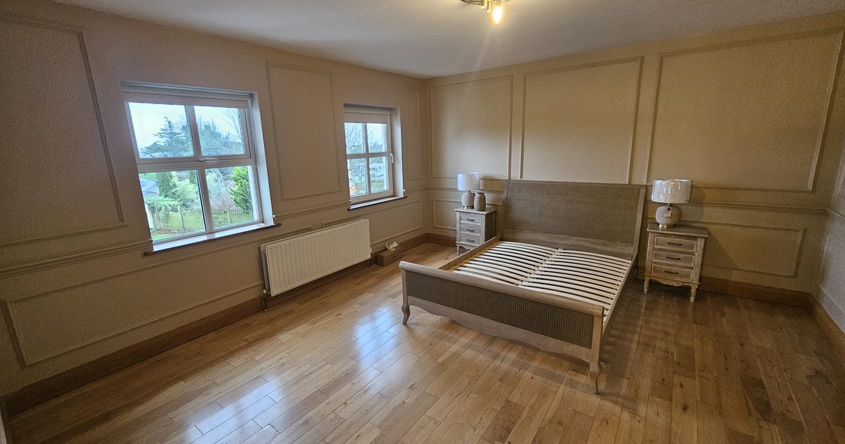
Approach 2: Complementary warm neutrals. Use a warm cream or greige in main living spaces and a warmer, slightly more characterful tone in bedrooms and private rooms. Keep the woodwork consistent throughout — white or off-white eggshell in every room.
Approach 3: Warm neutrals with one or two accent rooms. The majority of the house in neutral tones, with a bedroom or study in a deeper, more characterful colour — a soft sage, a warm terracotta, a subtle blue. The neutral rooms make the accent room feel considered rather than random.
Specific Recommendations for Irish Homes
These are colours that I’ve seen work reliably across various room types in Co. Monaghan homes:
Warm whites: Dulux Timeless, Crown Warm White, Farrow & Ball All White or Pointing. These consistently read as clean without being cold.
Soft creams: Dulux Magnolia (unfairly maligned — in a warm formulation it’s a reliable, pleasant neutral), Farrow & Ball String or Matchstick, Crown Linen White.
Greiges: Dulux Warm Pewter, Crown Putty, Farrow & Ball Elephant’s Breath. Versatile and contemporary without being stark.
Soft greys with warm undertones: Dulux Perfectly Taupe, Crown Pebble Shore. These sit in the warm-cool middle ground well.
Woodwork: The Constant
Whatever palette you choose for your walls, the woodwork — skirtings, architraves, door frames, and doors — is typically white or off-white throughout the whole house. This consistency ties every room together even if the wall colour changes room to room.
The specific white matters. Brilliant white woodwork against warm-toned walls can look stark. A softer white — like Dulux Trade Brilliant White tinted down slightly — often works better with warm neutral walls.
Testing Is Non-Negotiable
None of the above replaces testing paint directly on your walls, in your specific rooms, under your specific lighting. Buy tester pots. Paint swatches of at least A3 size on each wall you’re considering. Look at them in morning light, afternoon light, and under your evening artificial light. If it still looks right after 48 hours, proceed.
For more guidance on choosing colours specifically for key rooms, read our guide on how to choose the right paint colours for your living room. For an understanding of how different finishes affect how neutrals read, see our guide on eggshell, satin and matt paint finishes.
For our full interior painting service across Carrickmacross and Co. Monaghan, visit our interior painting service page.
Want colour advice and professional results in Carrickmacross or Co. Monaghan? Call or WhatsApp Mark today: 0879197709. Free quotes.
Need professional interior painting services in Carrickmacross?