How to Choose the Right Paint Colours for Your Living Room
Choosing paint colours for your living room doesn't have to be stressful. This guide from a professional interior painter in Carrickmacross walks you through everything you need to know.
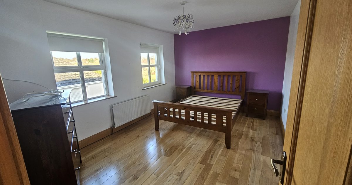
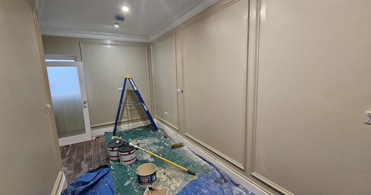
Choosing the right paint colour for your living room is one of the most impactful decisions you can make when decorating your home. Get it right and the whole room feels transformed. Get it wrong and even the most expensive furniture can look flat and uninviting.
As a professional interior painter based in Carrickmacross, Co. Monaghan, I’ve helped hundreds of homeowners navigate this exact decision. Here’s what I’ve learned.
Start With the Light in Your Room
Before you even open a colour chart, spend a day observing how light moves through your living room. North-facing rooms in Ireland tend to get cool, indirect light all day. South-facing rooms are brighter and warmer. This matters enormously for colour choice.
Cool, grey-toned colours like Dulux Polished Pebble or Crown Putting Green can look beautiful in bright rooms but feel dingy and cold in a north-facing room. Warm whites and soft creams, on the other hand, perform well in almost any Irish living room because they reflect available light rather than absorbing it.
If your living room doesn’t get much natural light, lean toward warm neutrals — think soft whites with a yellow or pink undertone rather than a blue one. Farrow & Ball’s Pointing, Dulux White Mist, or Crown’s Warm White are all reliable choices.
Understand Undertones
This is where most homeowners come unstuck. Every paint colour — even white — has an undertone. A white with a blue undertone will look clinical and cold. A white with a green undertone can look sickly under artificial light. A white with a yellow or pink undertone will feel warm and welcoming.
Hold paint swatches up to your wall at different times of day and under your actual light bulbs. What looks lovely in the shop can look completely different once it’s on your walls at home.
The same principle applies to greys, which are enormously popular in Irish homes right now. Some greys pull purple, some pull blue, and some pull green. None of these effects are obvious on a small chip — but they become very obvious across a full room.
Use the 60-30-10 Rule
Interior designers use a simple formula that works every time:
- 60% of the room in your dominant colour (walls)
- 30% in a secondary colour (soft furnishings, curtains)
- 10% in an accent colour (cushions, artwork, accessories)
This gives the eye somewhere to rest and somewhere to go. It prevents the room from feeling either flat or chaotic.
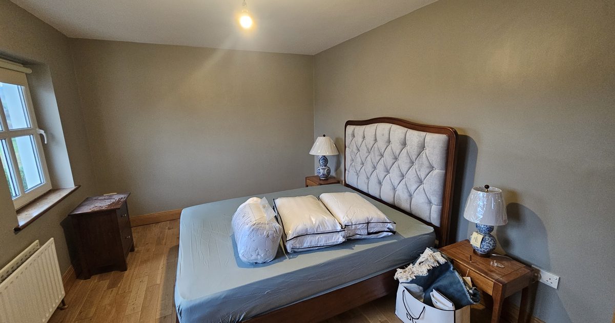
For a classic Monaghan living room, you might do warm white walls (60%), a deep navy or forest green sofa (30%), and brass or gold accessories (10%). It’s timeless, elegant and works with both modern and traditional interiors.
Test Before You Commit
Never choose a paint colour from a small chip alone. Buy tester pots — they cost a couple of euro and can save you hundreds on repainting a room you hate.
Paint a large swatch directly onto the wall — at least A3 size. Look at it in the morning, in the afternoon, and in the evening under your lights. If it still looks good after 48 hours of living with it, you’re on safe ground.
Better still, paint swatches on different walls in the same room. The same colour can look warmer on a sunlit wall and cooler on a shaded one.
Popular Colour Choices for Irish Living Rooms in 2025
Here are some consistently popular and well-performing choices:
Soft whites and creams: Dulux Timeless, Farrow & Ball Pointing, Crown Warm White. These never date and always feel fresh.
Warm greiges: A blend of grey and beige. Dulux Warm Pewter, Crown Coastline. Very versatile, works with warm and cool furniture tones.
Sage and muted greens: Huge in the past few years and still going strong. Farrow & Ball Mizzle, Dulux Sage Serenity. These bring the outside in and feel calm and grounded.
Deep, dramatic tones: For a feature wall or a room with good light — navy, forest green, deep terracotta. These add richness and depth that no amount of accessories can replicate.
Don’t Forget the Ceiling
Most people paint their ceiling brilliant white without thinking about it. But if your walls are a warm, creamy tone, a brilliant white ceiling can look stark by comparison. Try a very pale version of your wall colour on the ceiling — just ask your painter to mix it at 20% strength. It makes the whole room feel more cohesive.
Also worth considering: how many coats of paint does a room really need — getting this right is just as important as the colour itself.
Think About the Finish
Colour and finish work together. A flat matt finish will make a colour look deeper and more sophisticated. A soft sheen will make the same colour look lighter and brighter. Read more about this in our guide to eggshell, satin and matt paint finishes.
For living rooms in Co. Monaghan family homes, I typically recommend a durable soft sheen or velvet finish — it stands up to everyday wear far better than flat matt while still looking elegant.
When to Call a Professional
Even if you’re confident choosing colours, a professional painter brings something a DIY job rarely achieves: a perfectly prepared surface, clean lines, and an even, blemish-free finish that makes the colour sing.
Surface prep is everything. Bare patches, old polyfilla, uneven texture — all of these show through paint, no matter how good the colour is. Read our guide on how to prepare walls before painting for more on why preparation is half the job.
Looking for an interior painter in Carrickmacross or anywhere across Co. Monaghan? Call or WhatsApp Mark today: 0879197709. Free quotes, reliable service, professional finish.
Need professional interior painting services in Carrickmacross?